The Vergecast on WWDC 2025’s 'Liquid Glass'
Apple's WWDC 2025 unveiled “Liquid Glass,” a striking new design language that redefines user interface aesthetics across iOS, macOS, iPadOS, and beyond. Discussed in depth on The Vergecast, this translucent, spatial UI marks Apple’s shift toward immersive, ambient design—raising questions about performance, accessibility, and usability while showcasing the company's continued mastery in visual innovation across its ecosystem.
✨ Raghav Jain
Below is an in‑depth article capturing the highlights, analysis, and conversations from The Vergecast episode “Liquid Glass, Spotlight, and the rest of WWDC 2025”, focusing particularly on Apple’s new Liquid Glass design language.
1. Introduction to The Vergecast Episode
In a roughly 90‑minute episode, Nilay Patel and David, joined by Allison Johnson and Victoria Song from The Verge, unpacked Apple’s WWDC 2025 keynote with a central spotlight on Liquid Glass. They also discussed updates across macOS 26 (Tahoe), iOS 26, iPadOS 26, watchOS 26, visionOS 26, and hardware-adjacent AI features.
2. What Is Liquid Glass?
– A universal design overhaul: Liquid Glass is Apple’s first truly cross‑platform design update, unifying UI elements on iPhone, iPad, Mac, Watch, and TV.
– Visual properties: It’s inspired by real glass—transparent, refractive, dynamic, reacting to movement and light (real‐time rendering, specular highlights).
– Components covered: Buttons, sliders, switches, text, media controls, sidebars, dock, notification center, Control Center, even app icons and widgets.
3. Designers’ Perspective (The Vergecast Commentary)
– Why make the change? Apple aims for coherence across devices, drawing cues from visionOS’s spatial UI. The Vergecast team noted it’s a philosophical revival of glass-like UI—akin to Microsoft’s Aero—seen as a cycle in design trends.
– Aesthetic vs. usability: Nilay and team debated whether the translucent effects improve focus or add distractions. Some dynamic now‑you‑see‑me‑now‑you‑don’t movements “float” content better, but could also result in visual noise.
4. Implementation Across Platforms
iOS 26 & iPadOS 26:
- Lock screen and Home screen have frosted glass overlays; time dynamically resizes to fit photographic subjects.
- Tab bars shrink upon scroll, expanding back elegantly—mirroring content-driven UI.
macOS Tahoe 26:
- Transparent menu bar and dock, tinted sidebars that reflect desktop content for depth and spatial context.
watchOS 26:
- Glassy elements in UI and new gestures (like wrist-flick controls), plus “Workout Buddy”—an AI coach with motivational cues.
visionOS 26 & tvOS 26:
- Spatial layering and UI continuity, aligning virtual spaces with real-world aesthetics.
5. Technical Foundations & Developer Tools
- Apple released updated SwiftUI/UIKit/AppKit APIs to help developers adopt Liquid Glass.
- Includes new “Icon Composer” for crafting refractive, adaptive icons and hydrated UI components.
6. Early Impressions: Balancing Visuals and Function
The Verge & others offered early hands‑on reviews of iOS 26 dev beta:
- Visual novelty: App icons and controls appear bubbled and weightless, audacious and fresh.
- Criticisms: Some transparency creates clutter in Control Center and Settings, harming readability.
- Positive take: Unique touches, like droplet‑style tab switch animations, show Apple’s attention to micro‑interactions.
- Verdict: Grows on users with refinement before fall launch.
7. Broader WWDC 2025 Context
Liquid Glass heads a set of changes across Apple platforms:
- OS renaming switches to year-based (e.g., iOS 26, macOS Tahoe 26)
- Major software upgrades: spotlight enhancements on Mac, upgraded multitasking on iPad, new AirPods photo-capture features, CarPlay boosts, and revamped apps (Photos, Music, Camera).
- AI & Siri: Apple Intelligence APIs opened to devs; on-device models for translation and screenshot insights. Siri overhaul delayed and minimal in keynote.
8. Criticisms & Skepticism
- Some view Liquid Glass as minor styling, not radical UX innovation—comparisons to Windows Aero’s missteps suggest caution.
- Potential readability issues: too much transparency may reduce contrast, complicating day-to-day use.
- Technical cost: real-time rendering may strain older devices and battery life—sparking planned-obsolescence concerns.
9. The Vergecast's Takeaway
The team framed WWDC 2025 as Apple’s return to fundamentals—solid, polished updates—not ambitious leaps. Liquid Glass epitomizes this approach: an aesthetic-led, coherent revision rather than paradigm-shifting innovation. Whether this strategy resonates depends on users’ tolerance for stylistic updates versus feature breakthroughs.
Apple’s WWDC 2025 keynote was marked by the debut of “Liquid Glass,” a sweeping, platform-wide visual overhaul that The Vergecast described as both a bold aesthetic statement and a cautious evolutionary step in design philosophy, with the Verge team—Nilay Patel, David Pierce, Allison Johnson, and Victoria Song—offering a layered, critical analysis of its implications across the Apple ecosystem. Liquid Glass is not merely a stylistic flourish; it represents a conceptual return to skeuomorphism with a futuristic twist, defined by hyperreal glass-inspired elements that shift dynamically in response to user interaction, light, and device orientation. Across the episode, the hosts examined the roots of Apple’s design evolution, noting how Liquid Glass is heavily influenced by visionOS—the UI introduced with Apple Vision Pro—and brings that spatial, dimensional feeling to flat devices like the iPhone, iPad, and Mac. The Vergecast dissected the rollout across iOS 26, macOS Tahoe, iPadOS 26, and beyond, pointing out how buttons now refract content underneath, sidebars are translucent with subtle parallax behavior, and even app icons adopt adaptive rendering based on environment and movement. Nilay humorously but insightfully likened this to Microsoft’s Aero from Windows Vista days, cautioning that while it looks stunning in motion, it risks becoming a performance or usability burden if not finely tuned. The Liquid Glass aesthetic is consistent across platforms, replacing previous shadows, bold tints, and hard gradients with something far more fluid, ambient, and perhaps more fragile—though paradoxically more immersive—and it permeates the OS at nearly every level, from the lock screen to the control center, from app chrome to system-level alerts. The podcast detailed how Apple also launched new developer APIs in SwiftUI, AppKit, and UIKit that allow custom components to inherit these characteristics, and introduced tools like Icon Composer to help developers render app icons in this layered, translucent, semi-specular style, reinforcing the design paradigm’s visual consistency. The Vergecast emphasized how the redesign is less about functional transformation and more about visual unification, aligning Apple’s platforms under one glassy, holographic ethos—essentially the same design grammar for phones, tablets, desktops, wearables, and even TVs. Despite the visual allure, the hosts did not shy away from questioning whether usability was being sacrificed at the altar of aesthetics, especially when transparency and blurring make certain UI elements—like settings menus or control center toggles—more difficult to decipher. Nilay raised the question of accessibility: how does Liquid Glass accommodate users with visual impairments or those who prefer high-contrast modes, and are these layered effects additive or distracting? The team noted that Apple has built in accessibility overrides but also speculated whether the feature set is too aggressive for non-flagship hardware. Performance concerns loomed over the conversation as well; Allison brought up how real-time light refraction and motion-based rendering might strain older devices or reduce battery longevity, possibly leading to planned obsolescence, or at least aggressive upselling of newer iPhones and iPads. That said, early beta impressions covered in the Vergecast were cautiously optimistic—users appreciated the elegance of floating navigation bars, the fluid transitions, and the playful physics of UI interactions like bouncing toggles or expanding search fields. The macOS implementation, called Tahoe, was described as the most comprehensive since Big Sur, with changes to the dock, window chrome, sidebar coloring, and icon behavior; desktop elements appear to “breathe” as the user interacts, and spotlight search, now integrated with Apple Intelligence, shows contextual pop-outs through a Liquid Glass shell. Meanwhile, in watchOS 26, the glassy design is paired with new interaction methods such as wrist flicks and eye-gaze focus, while on visionOS 2.0, the design folds seamlessly into the existing spatial UI layers, making Liquid Glass feel like a natural descendant of Apple’s augmented reality ambitions. Victoria noted that tvOS received the lightest touch, with updated overlays for media playback and subtle transparency effects, keeping the interface readable on large displays. Beyond visuals, The Vergecast also discussed how the Liquid Glass design was indicative of a deeper philosophical pivot: Apple is focusing more on aesthetic refinement than groundbreaking utility, aiming for cohesion rather than surprise. While the 2025 WWDC didn’t debut radically new hardware, the presenters noted that the keynote signaled a solidification of Apple’s vision for the next five years—one where AI, ambient interfaces, and design minimalism converge into something soothing and glassy, perhaps trading novelty for polish. There was also discourse around whether Apple’s insistence on making everything beautiful might introduce friction in fast-use scenarios; quick settings should be snappy and legible, not showpieces for rendering capability. At the same time, the team appreciated the restraint Apple showed in not using Liquid Glass as an excuse to overhaul existing navigation patterns—apps still behave the same, just dressed in new clothes. The update to Siri was largely ignored during the keynote, suggesting that AI might come later in the year in another event or staggered software drop, although Apple Intelligence features like email summarization and screenshot context did appear briefly under the Liquid Glass framework. Ultimately, The Vergecast hosts concluded that while Liquid Glass won’t change how people use their devices day-to-day, it will change how they feel using them—a subtle but meaningful distinction. It’s more of a vibe than a feature, they joked, but one that speaks to Apple’s maturing design identity: less flash, more finesse. The update will likely go through refinement phases as developer betas are released and user feedback rolls in, but its core aesthetic is here to stay. The Vergecast ended on the note that Liquid Glass, while not universally praised, reflects Apple’s bet on long-term emotional resonance—where form isn’t just following function, but attempting to shape it. Whether that bet pays off will depend on execution, accessibility, and user patience as the ecosystem slowly but surely absorbs this gleaming new skin.
Apple’s WWDC 2025 keynote marked a subtle yet profound shift in its design philosophy with the introduction of “Liquid Glass,” a new cross-platform visual language that quickly became the focal point of The Vergecast discussion featuring hosts Nilay Patel, David Pierce, Allison Johnson, and Victoria Song. The Vergecast, known for its sharp critiques and enthusiasm for tech design trends, dove deep into how Liquid Glass both pays homage to Apple’s design past and signals its aesthetic future, combining real-time translucency, depth, and responsive UI fluidity into a single system-wide visual strategy that spans iOS 26, macOS Tahoe, iPadOS 26, watchOS 26, tvOS, and visionOS. According to the podcast, Liquid Glass is not just a design update, but a deliberate emotional rebranding of how users experience digital content—imagine glass-like surfaces that subtly refract content beneath them, create spatial depth through lighting and motion cues, and appear to "breathe" with user interaction. The effect is inspired, in part, by the spatial UI of visionOS and Apple Vision Pro, where environments and controls appear to exist in a 3D space, even when displayed on 2D screens like the iPhone or MacBook. The hosts acknowledged Apple’s mastery in visual storytelling, crediting the company’s ability to create design systems that feel luxurious, immersive, and intentionally unified across products. However, the Vergecast didn’t treat this rollout as universally positive. Throughout the episode, the team voiced concern about whether this design language, while beautiful, might come at the cost of usability, clarity, and accessibility. Nilay questioned whether dynamic translucency—where interface layers subtly blend into backgrounds—might make reading text harder, or diminish focus on tasks, especially in complex apps or low-contrast environments. Allison pointed out that in some early developer betas, key elements in Control Center and Settings had become more difficult to visually distinguish, with too much glass and too little visual hierarchy. Still, the hosts agreed the visual appeal was undeniable. On iOS 26, Liquid Glass transformed the Lock Screen and Home Screen into living surfaces—widgets appeared to hover, app icons subtly shifted based on light source orientation, and tab bars dynamically shrank or expanded based on scroll behavior. On macOS Tahoe, Liquid Glass was perhaps most evident, reshaping the Dock with real-time depth and glow effects, reimagining Finder sidebars with layered translucency, and making window chrome feel light, almost non-existent, placing content at the forefront. The podcast emphasized that this was more than a coat of paint—Apple also introduced new developer tools including an upgraded SwiftUI framework and an “Icon Composer” utility that allows third-party developers to build icons that adhere to the Liquid Glass paradigm. These adaptive icons respond to ambient light and system theme in real time, helping maintain visual consistency across applications and the broader OS ecosystem. On iPadOS, multitasking windows and Stage Manager also gained Liquid Glass’s spatial layering, making app switching feel smoother and more deliberate. WatchOS 26 incorporated the design in a lighter form, applying the aesthetic to notification banners, glances, and a redesigned Workout interface, while tvOS 18 kept the changes minimal, likely to preserve legibility on large displays. VisionOS 2.0, meanwhile, folded Liquid Glass directly into its spatial computing architecture, aligning with the spatial glass metaphor that underpins the Vision Pro experience. The Vergecast noted that all of these changes point to Apple’s desire for a “holographic future”—a reality where user interface isn’t simply seen or touched but experienced as part of a living, layered digital environment. Yet, the team reminded listeners that flashy design is no substitute for performance. One of the major concerns raised was whether the rendering engine behind Liquid Glass could run efficiently across the entire product lineup. Older devices may struggle with the computational cost of real-time light refraction, blur effects, and animated depth cues, which could not only slow down the UI but also drain battery life faster. There was speculation that this design update might be a quiet push to nudge users toward upgrading to newer, more capable hardware. From a developer standpoint, the response was mixed. While Apple provided the necessary API support and extensive documentation, some developers reported the learning curve to be steep, especially for apps with custom UI that didn't previously follow Apple's Human Interface Guidelines closely. The Vergecast team expressed hope that by the time iOS 26 and macOS Tahoe are released to the public in the fall, many third-party apps would adopt Liquid Glass components seamlessly, but they warned that the transition period could be visually jarring, with inconsistent design across frequently used apps. One of the more philosophical discussions on the podcast centered on whether Apple was retreating from functional innovation in favor of visual polish. With relatively few revolutionary features announced this year—aside from modest AI integrations and some Siri groundwork—the emphasis on Liquid Glass felt like a statement that Apple is choosing elegance and refinement over bold leaps. David Pierce commented that this shift could either delight long-time Apple fans or frustrate users looking for more substantive improvements in productivity, AI interaction, or hardware synergy. Nevertheless, the podcast agreed that this was a calculated move, not a lazy one—Liquid Glass may not be groundbreaking in function, but it builds emotional engagement with devices, an area where Apple has always excelled. Visual delight becomes a daily reward for using Apple products, and even if that delight is subtle, it can enhance user loyalty. Toward the end of the episode, the Vergecast speculated on the future: will Liquid Glass be remembered as a transformative design moment like skeuomorphism or flat design, or will it fade into the background as a transient trend? The answer, they mused, will depend on user reception, how well Apple balances visual flourish with accessibility, and whether developers embrace or resist the new design paradigm. Liquid Glass, at its best, is ambient, graceful, and quietly immersive—it makes your iPhone or Mac feel like it’s made of something alive, not just silicon and software. But at its worst, it risks turning the OS into an over-stylized mirror, where function is occasionally lost in the shimmer. As such, the podcast concluded with a tempered endorsement: Liquid Glass is an ambitious design vision, implemented with Apple’s characteristic precision, but it must remain in service of the user—not just the brand’s visual ego. Ultimately, it’s Apple’s bet on beauty over novelty, and time will tell whether users embrace this gleaming new layer—or ask for a way to turn it off.
Conclusions
- Liquid Glass signals Apple’s commitment to a cohesive ecosystem aesthetic—but don’t expect revolutionary features.
- Execution matters: subtle UI details might delight, but clutter and performance issues could alienate users.
- As a foundation, Liquid Glass offers future potential—if refinement precedes rollout this fall.
Q&A Section
Q1: What is “Liquid Glass” in Apple’s WWDC 2025?
Ans: Liquid Glass is Apple’s new cross‑platform design language featuring glass‑like transparency, real‑time refraction, fluid animations, and a unified visual aesthetic introduced at WWDC 2025 across iOS 26, macOS Tahoe 26, iPadOS, watchOS 26, and tvOS 26.
Q2: Which platforms and UI elements are affected by Liquid Glass?
Ans: It spans iPhone, iPad, Mac, Watch, and TV, influencing UI components like buttons, sliders, tab bars, sidebars, Control Center, Dock, Notification Center, widgets, and app icons.
Q3: Did early users find it helpful, or just decorative?
Ans: Early impressions praised its shimmering novelty—like floating tab indicators—but flagged readability issues (especially in Control Center), clutter, and spacing inconsistencies.
Q4: How can developers adopt Liquid Glass in their apps?
Ans: Apple released updated SwiftUI/UIKit/AppKit APIs plus an “Icon Composer” tool to craft refractive, adaptive Liquid Glass components, aiding developers in visually aligning apps with the new design.
Q5: Is Liquid Glass a major innovation or minor redesign?
Ans: Apple frames it as its most significant design update ever—but critics see it as a visual refresh rather than a UX revolution, betting on coherence instead of transformative features.
Similar Articles
Find more relatable content in similar Articles
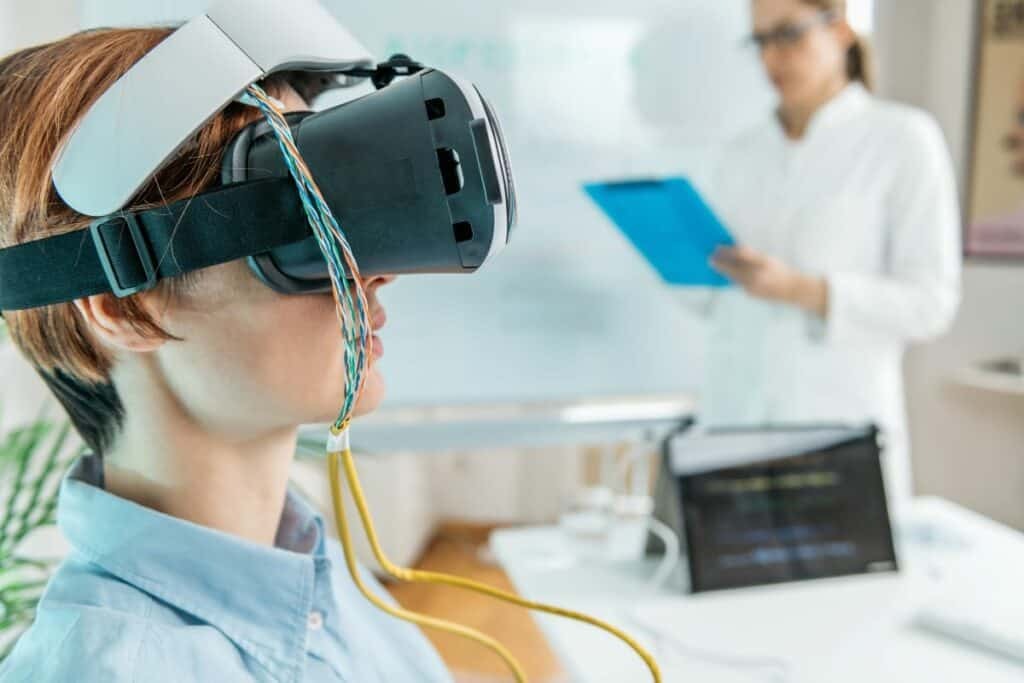
Virtual Reality Therapy: Heali..
Virtual Reality Therapy (VRT) .. Read More

The Future of Electric Planes ..
The aviation industry is under.. Read More
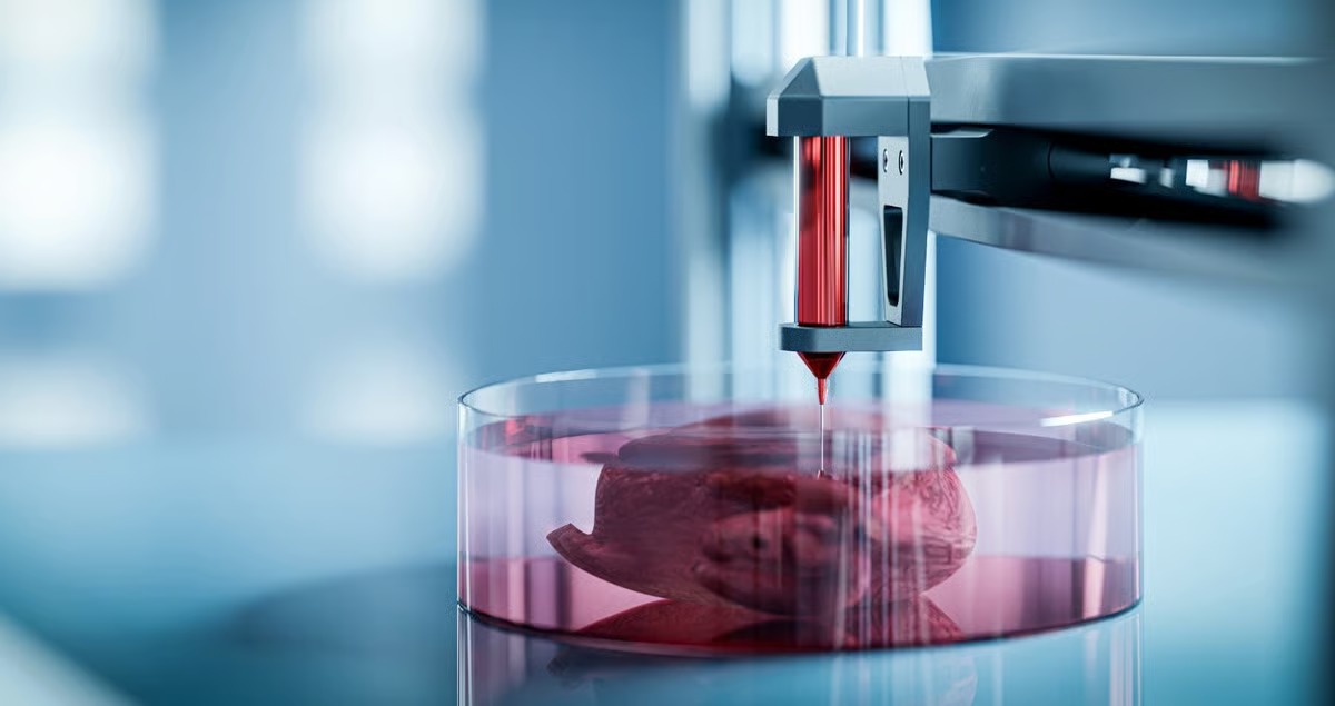
3D-Printed Organs: Are We Clos..
3D-printed organs are at the f.. Read More
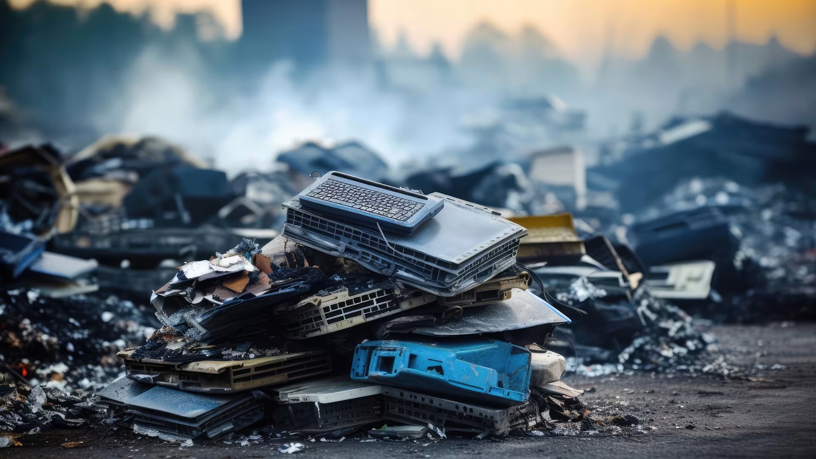
E-Waste Crisis: The Race to Bu..
The rapid growth of electronic.. Read More
Explore Other Categories
Explore many different categories of articles ranging from Gadgets to Security
Smart Devices, Gear & Innovations
Discover in-depth reviews, hands-on experiences, and expert insights on the newest gadgets—from smartphones to smartwatches, headphones, wearables, and everything in between. Stay ahead with the latest in tech gear
Apps That Power Your World
Explore essential mobile and desktop applications across all platforms. From productivity boosters to creative tools, we cover updates, recommendations, and how-tos to make your digital life easier and more efficient.
Tomorrow's Technology, Today's Insights
Dive into the world of emerging technologies, AI breakthroughs, space tech, robotics, and innovations shaping the future. Stay informed on what's next in the evolution of science and technology.
Protecting You in a Digital Age
Learn how to secure your data, protect your privacy, and understand the latest in online threats. We break down complex cybersecurity topics into practical advice for everyday users and professionals alike.
© 2025 Copyrights by rTechnology. All Rights Reserved.