How Foldable Phones Are Changing App Design.
Foldable phones are revolutionizing mobile app design by introducing dynamic screen sizes, multi-posture usage, and enhanced multitasking. These devices require apps to adapt fluidly across folded and unfolded modes, driving innovation in UI/UX, layout responsiveness, and interaction patterns. As foldables become mainstream, developers must rethink design strategies to deliver seamless, flexible, and immersive user experiences tailored to this evolving form factor.
✨ Raghav Jain
Introduction
Technology evolves rapidly, and with it, the way users interact with devices. One of the most significant advancements in mobile technology in recent years is the introduction of foldable phones. These innovative devices combine the portability of smartphones with the screen real estate of tablets, enabling users to switch between different form factors seamlessly. As this new category of devices grows, app developers and designers face unique challenges and opportunities.
This article delves into the impact of foldable phones on app design, how developers are adapting, the new principles being introduced, and what the future holds for mobile interfaces.
1. The Rise of Foldable Devices
Foldable smartphones like the Samsung Galaxy Z Fold, Huawei Mate X, and Motorola Razr have redefined mobile hardware. These devices can operate in multiple modes, including:
- Phone mode (folded)
- Tablet mode (unfolded)
- Tent or Flex mode (partially folded)
Each mode presents unique design constraints and possibilities. The transition between these modes must be fluid, and the user experience consistent.
Key Features Driving the Change:
- Multiple screen sizes in one device
- Split-screen and multi-window capabilities
- Continuity between screen states
- Dynamic UI reflowing
2. New Design Challenges
Designing apps for foldables isn't as simple as scaling up existing smartphone apps. Developers must rethink UI and UX to adapt to foldable environments.
A. Screen Continuity
Apps need to transition smoothly from the cover screen to the inner display without reloading or resetting the state. For example, if a user is watching a video in phone mode and unfolds the device, the video should seamlessly continue on the larger screen.
B. Responsive Layouts
Foldable screens introduce a new kind of responsiveness. Unlike standard phones that change orientation (portrait/landscape), foldables change form. Designers must:
- Use constraint-based layouts
- Implement adaptive UI elements
- Support multi-window interactions
C. Multi-Window and Multi-Tasking
Foldables encourage multi-tasking. Users can run multiple apps simultaneously on a larger screen. Apps must be able to:
- Run in split-screen mode
- Handle drag and drop
- Adjust behavior when sharing screen space
D. Hinge and Fold Awareness
Some devices have a visible hinge or crease that can affect interaction zones. Designers should avoid placing important UI elements in the middle fold or hinge area to prevent usability issues.
3. Google and Android's Support for Foldables
Google, the primary driver of the Android ecosystem, has taken significant steps to support foldables.
Android Features for Foldables:
- Jetpack WindowManager API: Detects fold posture, hinge orientation, and screen state.
- Activity Embedding: Allows activities to run side-by-side in different regions of the screen.
- SlidingPaneLayout Enhancements: Ideal for book-like UIs or dual-screen apps.
- Layout changes based on device posture (flat, tent, half-folded, etc.)
These tools enable developers to build apps that react dynamically to hardware states.
4. Emerging App Design Patterns
With foldables, entirely new user experiences are being invented. Here are some notable design patterns emerging in the foldable space:
A. Drag-and-Drop Interfaces
Apps like Samsung Notes allow users to drag images, links, or files between apps in multi-window mode. Designers are encouraged to:
- Design with contextual interaction in mind
- Provide visual feedback for draggable items
B. Extended Canvas Design
Instead of simply enlarging content, some apps provide more detailed interfaces when unfolded. For instance:
- Gmail may show the inbox on one side and the message view on the other.
- Maps may show both the map and location details side-by-side.
C. Split Task Flows
Foldable devices support dual-panel navigation. This allows users to perform different tasks on different parts of the screen, such as browsing on one side while editing on the other.
5. Examples of Foldable-Optimized Apps
A. Microsoft Outlook
The Outlook app dynamically adjusts its interface. On foldables, it displays the inbox and a selected email side-by-side—similar to its tablet version.
B. Spotify
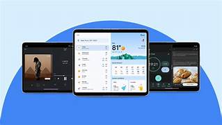
Spotify uses the larger screen to show more data—album art, lyrics, playlists, and controls—enhancing the user experience.
C. TikTok and Instagram
While still catching up, these apps are experimenting with showing feed content and detailed views (like comments or live reactions) simultaneously when the screen is unfolded.
6. Design Guidelines for Foldables
To design effective apps for foldable devices, developers and designers should follow key guidelines:
A. Consistency Across Modes
- Maintain the same state between folded and unfolded modes.
- Use state persistence to avoid user frustration.
B. Design for All Postures
- Consider half-open states like laptop mode (for video calls).
- Test app usability in Flex mode.
C. Optimize for Large Screens
- Use the extra space meaningfully.
- Avoid simply scaling up content.
D. Avoid the Hinge Zone
- Keep interactive elements (buttons, sliders) away from hinges.
- Use padding and layout constraints.
7. Development Best Practices
A. Use ConstraintLayout or Compose
Google’s Compose and ConstraintLayout provide responsive tools ideal for foldables.
B. Implement Responsive Navigation
- Use side navigation drawers for unfolded mode.
- Support bottom navigation for folded/compact mode.
C. Test on Emulators and Physical Devices
- Use Android Studio’s Foldable Emulator.
- Test physical transitions to understand context changes.
8. The Future of Foldables in App Design
The adoption of foldables is still in early stages, but they are gaining momentum. As hardware improves and prices decrease, foldables may become mainstream.
Innovations on the Horizon:
- Rollable displays
- Transparent screens
- Increased multi-app collaboration
- AI-driven layout adaptation
As these features mature, app design will become even more flexible and intelligent.
Foldable phones, once a sci-fi dream, are rapidly becoming a reality, and with their rise comes a paradigm shift in the way applications are designed, developed, and experienced across mobile platforms. These innovative devices, like the Samsung Galaxy Z Fold, Huawei Mate X, and Motorola Razr, offer dynamic screen sizes, enabling users to alternate between compact phone mode and expansive tablet-like displays, creating an entirely new realm of interaction that traditional smartphones couldn’t offer. Unlike conventional smartphones where app design only needed to consider portrait and landscape modes, foldables demand adaptive, flexible user interfaces that can accommodate multiple form factors, screen transitions, and multitasking environments. When users unfold their devices, apps must not only adjust seamlessly to a larger screen but also retain state, ensure layout reflow without glitches, and support rich multitasking capabilities such as drag-and-drop across apps or split-screen operations. This has forced developers to adopt a responsive, continuity-driven design approach, where maintaining consistency between folded and unfolded modes is paramount. Google, the custodian of Android, has proactively introduced tools like the Jetpack WindowManager API and activity embedding to allow developers to query device posture, detect hinge positions, and design UIs that intelligently adapt to screen changes in real time. Moreover, foldable devices introduce the concept of posture-aware applications—where apps behave differently in tent mode, flex mode, or fully unfolded mode—requiring a deep rethink of how user flows and task completion journeys are constructed. Designers are now creating dual-pane layouts for email clients where the inbox and message view appear side-by-side, media apps that shift to extended playback controls and full-screen lyric displays when unfolded, and productivity tools that offer simultaneous document editing and preview capabilities, mimicking desktop-class experiences. These unique capabilities challenge the conventional mobile app navigation patterns, urging developers to build interfaces that transition smoothly between various screen configurations while leveraging every inch of available space without overwhelming users. Another core consideration is the hinge itself; while a marvel of engineering, the hinge area is often non-interactive, meaning critical UI elements must be carefully placed outside the crease for optimal usability. This has led to new design guidelines and UI pattern conventions, where padding and dynamic layouts are not optional but essential. Developers are encouraged to use ConstraintLayout or Jetpack Compose to create UIs that stretch, contract, and reorganize themselves intelligently based on screen context. Additionally, apps must be tested rigorously—not just on emulators, but also on physical devices—to ensure performance integrity during actual folds and unfolds, especially in scenarios involving media playback, data input, or navigation transitions. The multi-window capability of foldables adds another layer of complexity and opportunity, pushing designers to enable apps to run alongside others without visual or functional degradation. Applications like Microsoft Outlook, Google Maps, and Samsung Notes have set early benchmarks by adapting gracefully to split-screen operations, offering dual-pane support and drag-and-drop functionality that enhances productivity and elevates user experience. Foldables also inspire a reconsideration of content hierarchy; designers are rethinking how and when to display information, determining what is essential in the compact mode and what can be expanded in tablet mode. Navigation paradigms, too, are evolving—from hamburger menus and bottom nav bars to more fluid, context-sensitive navigation drawers that adapt to space availability. As foldable adoption grows, apps that fail to optimize may appear outdated or broken, risking poor user retention. In response, companies are exploring progressive enhancement strategies, ensuring their apps work on all devices but scale beautifully on foldables. This philosophy enables apps to offer base-level functionality across traditional devices while unlocking premium, enhanced features on foldables. The possibilities extend even further with the future potential of rollable screens, tri-fold devices, and transparent displays, where real-time adaptability, posture sensitivity, and intelligent layout management will become core to app functionality. Moreover, the foldable form factor presents a unique opportunity for accessibility design; the flexibility of screen modes can assist users with varying vision and motor needs by presenting content in more readable formats or reducing reachability burdens. As hardware evolves, so too must the software ecosystems around it—pushing the boundaries of interaction, layout design, state management, and device collaboration. This disruption isn’t merely a challenge but a creative canvas, inviting developers and designers to innovate and redefine what apps can be in the post-smartphone world. While foldables are still carving out their space in the mainstream market, their potential is clear: they offer not just more screen space, but new ways to think about space, time, context, and task orientation in mobile computing. Consequently, designers and developers must shift from thinking in rigid breakpoints to embracing fluid, responsive, and modular experiences that can morph in real-time. The companies that embrace these changes early—by updating their app architectures, investing in flexible design systems, and staying aligned with platform advancements—will be the ones leading the charge as foldables evolve from a novelty to a necessity. In conclusion, foldable phones are not simply reshaping hardware—they’re revolutionizing how we conceptualize, design, and interact with mobile applications, setting the stage for a future where apps are not just responsive but truly adaptive to the user's context, screen posture, and multitasking needs.
Foldable phones represent a transformative evolution in mobile technology, challenging long-standing paradigms of app design and redefining how users engage with digital content. These devices, such as the Samsung Galaxy Z Fold, Huawei Mate X, and Motorola Razr, are equipped with flexible OLED displays that allow them to transition between compact smartphone modes and expansive tablet-like interfaces, introducing a versatile user experience that necessitates a complete reimagining of UI and UX strategies. Unlike traditional smartphones, which operate within fixed dimensions and limited screen orientations (portrait and landscape), foldables dynamically change their physical form, screen resolution, and aspect ratio as they are folded and unfolded, often in real time, making static design principles insufficient and prompting developers to adopt responsive, modular, and adaptive design frameworks that account for these variations. One of the core challenges introduced by foldables is screen continuity—users expect their apps to transition flawlessly from a small outer screen to a larger internal display without any disruption to functionality or data state, requiring careful implementation of persistent states, activity recreation logic, and layout reflows. Beyond that, foldable devices encourage multitasking through native support for split-screen and multi-window modes, which means that applications must be capable of rendering cleanly in shared screen environments while still maintaining clarity, usability, and performance. Apps must now be aware not just of screen size but also of device posture—folded, unfolded, tent mode, or partially folded (like a laptop)—and must adjust their layouts, controls, and content density accordingly to avoid poor user experiences or interface clutter. For example, in half-folded 'Flex mode,' video calling apps may place the video feed on the upper screen while showing controls and chat in the lower half, a behavior that requires intentional, posture-sensitive design logic. To address these needs, platform providers such as Google have introduced specialized tools and APIs, including the Jetpack WindowManager, which allows developers to detect the hinge position, screen dimensions, and posture state, enabling apps to adapt dynamically. Jetpack Compose, another powerful toolkit, facilitates the construction of declarative and flexible UIs that can intelligently rearrange themselves as the physical characteristics of the screen change. Furthermore, developers are encouraged to avoid placing critical interactive elements in the hinge or crease zone—an area that may be less visually clear or physically comfortable to interact with—necessitating the use of design patterns that space elements away from screen centerlines or use dynamic padding that adjusts in real time. New design principles have emerged specifically for foldables, such as extended canvas layouts that show additional content or controls when unfolded, dual-pane views for email or messaging apps that mimic desktop experiences, and drag-and-drop interfaces that allow users to move content fluidly between apps running side by side. Applications like Microsoft Outlook, Google Maps, and Samsung Notes already demonstrate how thoughtfully optimized foldable experiences can feel intuitive and powerful—Outlook, for instance, displays both the inbox and selected message side by side on larger screens, while Samsung Notes allows users to open reference material in one pane while writing in another, simulating a true productivity workspace. As foldable devices mature and become more common, developers are expected to adopt a mindset of designing for fluidity, where transitions between device modes are not interruptions but opportunities for enhanced interaction. Testing becomes even more critical in this environment, as emulators and physical devices must be used to simulate various folding scenarios, hinge positions, and multi-window behaviors to ensure the app performs reliably in all contexts. Content hierarchy must be reconsidered too; developers must decide what information or functionality is prioritized in compact modes versus what gets revealed or expanded when unfolded, necessitating a new level of content awareness and strategic layout planning. Foldables also promote more advanced use of gesture-based controls and encourage the development of context-aware features that respond to how a user is holding or viewing the device, whether flat on a table, in hand, or propped up. Developers are also finding that foldables offer new accessibility opportunities, such as larger text display modes, improved visual segmentation, and more ergonomic two-handed usage, all of which benefit users with different needs and preferences. The implications of foldable innovation stretch beyond design and into the architecture of mobile apps themselves; apps must now be more modular, with components that can be reassembled on the fly depending on the available screen space and user actions. This modularity aligns well with modern development trends like micro frontends and composable UIs, potentially accelerating the adoption of scalable design systems across Android ecosystems. Foldables have also reignited interest in dual-screen and multi-display support, where applications may eventually span not just two halves of a single device but multiple devices working in tandem, as seen in early experiments with companion devices and ambient computing. Despite current limitations—such as cost, durability concerns, and limited consumer adoption—the design momentum around foldables is growing rapidly, fueled by hardware innovation, increased support from operating systems, and demand from early adopters for more powerful, immersive mobile experiences. As foldables pave the way for other flexible technologies like rollable and stretchable displays, designers and developers must remain agile, continuously learning and iterating to keep up with this hardware-software convergence. Ultimately, foldable phones are not just adding screen space; they are introducing a new language of interaction—one that’s fluid, spatial, and more adaptable to human behavior. By rethinking interface layers, input models, and content presentation strategies, developers can create apps that feel not just compatible with foldables but native to them, delivering a truly next-generation user experience. Those who embrace this change early and learn to innovate within the constraints and possibilities of foldables will not only future-proof their apps but also help define the new standards of mobile computing in the years to come.
Conclusion
Foldable phones are not just a passing trend; they represent a significant shift in mobile device usage. For developers and designers, the challenge is to embrace this change and create applications that fully leverage the unique capabilities of foldable screens. Those who adapt quickly will be at the forefront of a new era in mobile experience design—where fluidity, adaptability, and immersive interactions define success.
Q&A Section
Q1: What are the main challenges of designing apps for foldable phones?
Ans: The main challenges include maintaining state continuity between folded and unfolded modes, optimizing UI for different screen sizes and orientations, managing multi-window interactions, and avoiding usability issues in the hinge or crease areas.
Q2: How do foldable phones influence user experience?
Ans: Foldables offer larger displays, which enhance multitasking and immersive experiences. Users can interact with apps in new ways, like running multiple apps side-by-side, dragging and dropping content, or using a device in tent mode for media consumption or video calls.
Q3: What tools can developers use to optimize apps for foldables?
Ans: Developers can use the Jetpack WindowManager API, ConstraintLayout, Jetpack Compose, Android Emulator for foldables, and Activity Embedding. These tools help apps respond dynamically to device posture and screen changes.
Q4: Are foldable phones becoming mainstream?
Ans: While still a niche market, foldables are gaining popularity. Companies like Samsung, Google, and Huawei are investing heavily, and as prices lower, foldables are expected to become a standard mobile device format.
Q5: Can existing apps run on foldable phones without changes?
Ans: Yes, but they may not provide an optimal experience. Without specific adjustments, apps might not take advantage of foldable features like multi-window support, adaptive layouts, or seamless transitions between modes.
Similar Articles
Find more relatable content in similar Articles

The Future of Electric Planes ..
The aviation industry is under.. Read More

3D-Printed Organs: Are We Clos..
3D-printed organs are at the f.. Read More

E-Waste Crisis: The Race to Bu..
The rapid growth of electronic.. Read More

Virtual Reality Therapy: Heali..
Virtual Reality Therapy (VRT) .. Read More
Explore Other Categories
Explore many different categories of articles ranging from Gadgets to Security
Smart Devices, Gear & Innovations
Discover in-depth reviews, hands-on experiences, and expert insights on the newest gadgets—from smartphones to smartwatches, headphones, wearables, and everything in between. Stay ahead with the latest in tech gear
Apps That Power Your World
Explore essential mobile and desktop applications across all platforms. From productivity boosters to creative tools, we cover updates, recommendations, and how-tos to make your digital life easier and more efficient.
Tomorrow's Technology, Today's Insights
Dive into the world of emerging technologies, AI breakthroughs, space tech, robotics, and innovations shaping the future. Stay informed on what's next in the evolution of science and technology.
Protecting You in a Digital Age
Learn how to secure your data, protect your privacy, and understand the latest in online threats. We break down complex cybersecurity topics into practical advice for everyday users and professionals alike.
© 2025 Copyrights by rTechnology. All Rights Reserved.